


Branding / Identity Design / Brand guide
Napa Valley Transportation Authority
In 2015 we partnered with Green Ideas to support the Napa Valley Transportation and Planning Agency (NCTPA) with their re-branding of their main brand and to unify their 12 sub-brands.
The goal of creating a new and easily recognizable identity was to:
Make alternative means of transportation (instead of driving) more attractive.
Build awareness to pass tax measures that help NCTPA counter the major traffic congestion problems facing Napa County.
The Challenge
5 Cities & 1 County under One Agency
The NCTPA serves 5 cities: American Canyon, Calistoga, Napa, St. Helena, Yountville and the County of Napa. The 12 board members of the NCTPA consist of municipal mayors and council members, and oversees all forms of transportation in the Valley, including walking, biking, car-sharing, public bus system, driving and parking.
Each city and mode of transportation had its own character and identity with its own logo and brand.
The challenge was to get everybody on board to create a new brand and to make them feel engaged, excited, and included in the process.
Our journey began here - Original Identity and bus design:

Success
Standing Ovation
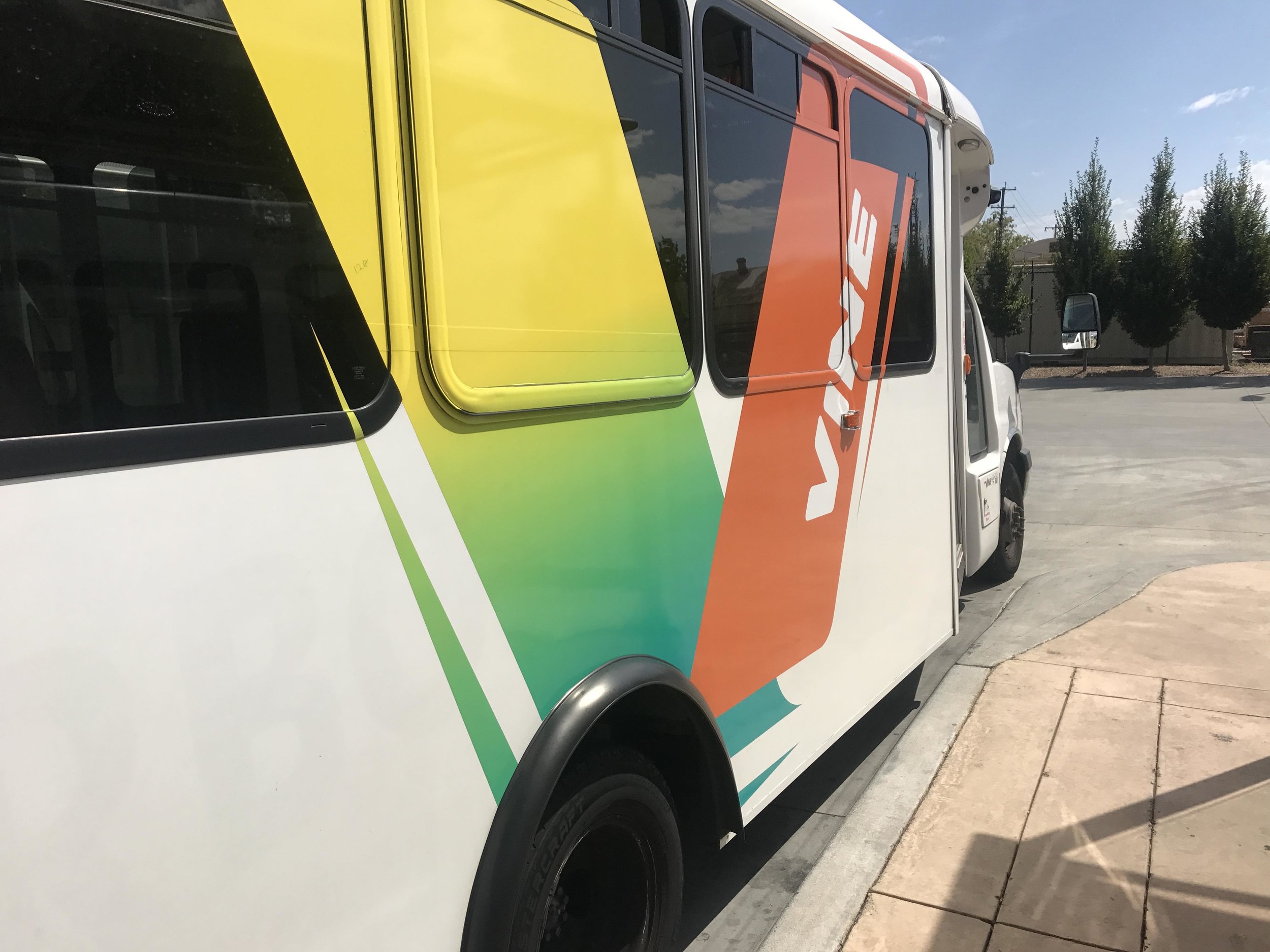
The twelve agency board members unanimously voted to approve the agency rebranding just 15 minutes after our presentation. The new agency name was now: Napa Valley Transportation Authority – NVTA. The buses are still called VINE but the logo was completely redesigned.
“After all the years in government, I have never seen a political body make a unanimous decision in such a short amount of time.”


Results
The Process was the Solution
Our rebranding effort was so successful because we utilized a six-month stakeholder engagement process informed by Human Centered Design (HCD) developed by IDEO. This allowed us to more deeply understand how the community experiences Napa as a place, the VINE bus service, the other the services the NVTA offers, and the agency’s existing brand.
What was unique about our approach is that we gathered qualitative as well as quantitative data. We reached out through community organizations to demographic input that was as diverse as possible. The community engagement process is different from a simple survey, because we interview people and listen for things we might not have thought of. We talked to the community, kept the board members in the loop and even met with the bus drivers to get them involved as they would be the ambassadors of the new brand every day. This approach helped tremendously with the rebranding and re-positioning of the agency.
It became clear that the brand needed to stand for three key terms that universally represented the values across all groups: Scenic - Efficient - Visionary


Sub brands
The Vine
The brand of the bus service itself - the Vine - turned out to be well known and had a positive connotation, which is why we decided to keep the name. To reflect the findings of our research though, we reduced the logo to a simple but bold V that represents the scenic colors of the valley and the valley itself in its shape, with a forward looking, almost sporty feel to it. A whole new typeface (font) was derived from the shape of the new V, which we used to create the NVTA logo as well.
The same unique typeface we used to create all sub-brands for the local buses and special NVTA services.

BUS DESIGN
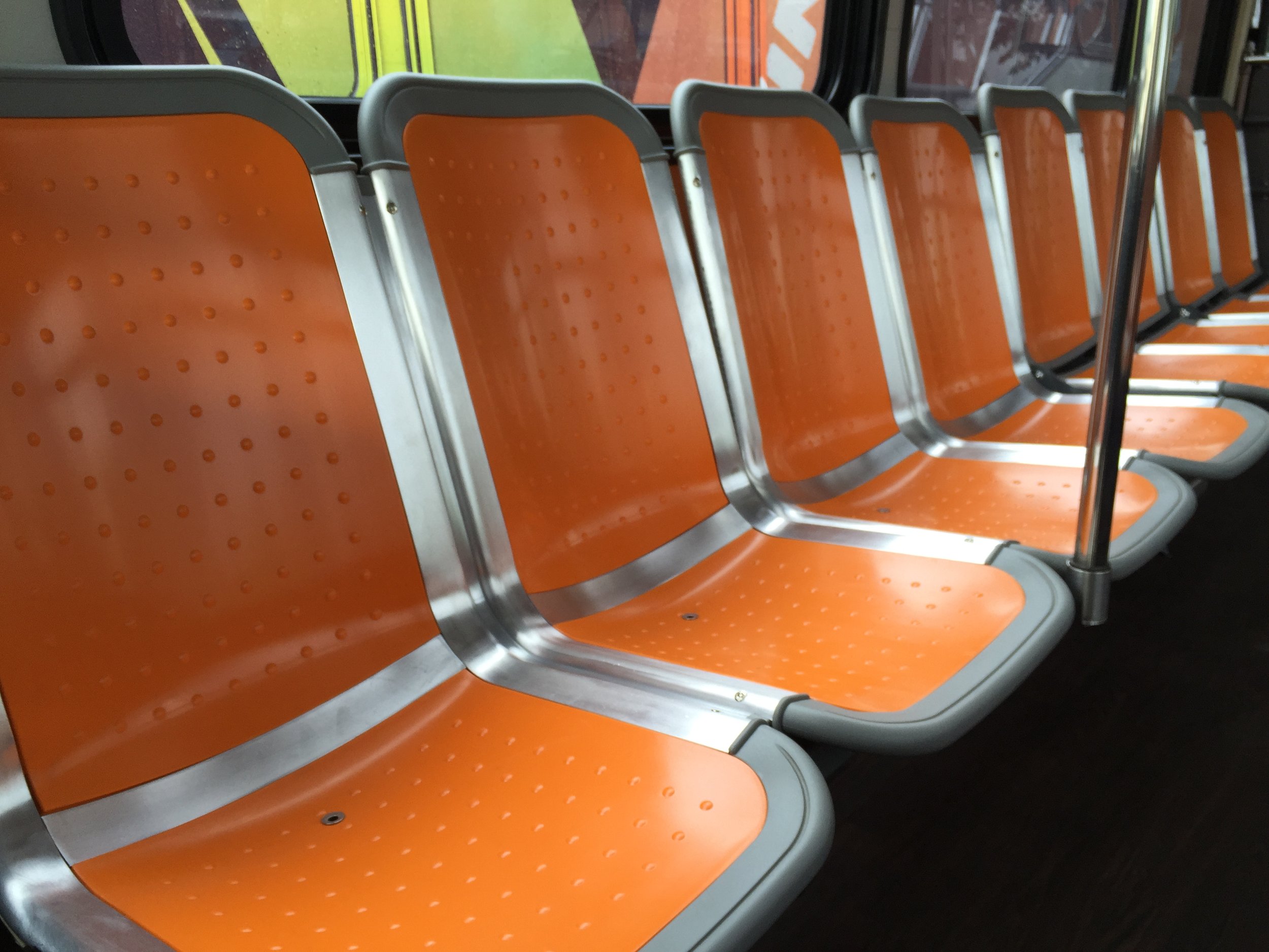
Creating an Experience
After the brands and logos where already approved, we proposed that their nine newly ordered buses needed to not only have a new look on the outside but impress the customers with a complete new design of the interior as well. The board of directors agreed and voted for those upgrades unanimously again, approving additional $128,092 to create a completely new experience for the users, inside and out.


USB PORTS BETWEEN SEATS FOR EASY CHARGING


Brand Rollout
Additional Marketing Materials
Keep scrolling to see more of our work.


