
Website / site architecture / uX / Ui / Visual Design
San Francisco Port | Website
This was an extremely fun as well as especially challenging project. In 2019, we were awarded the contract to redesign the Port website with our partners at Bonner Communications.
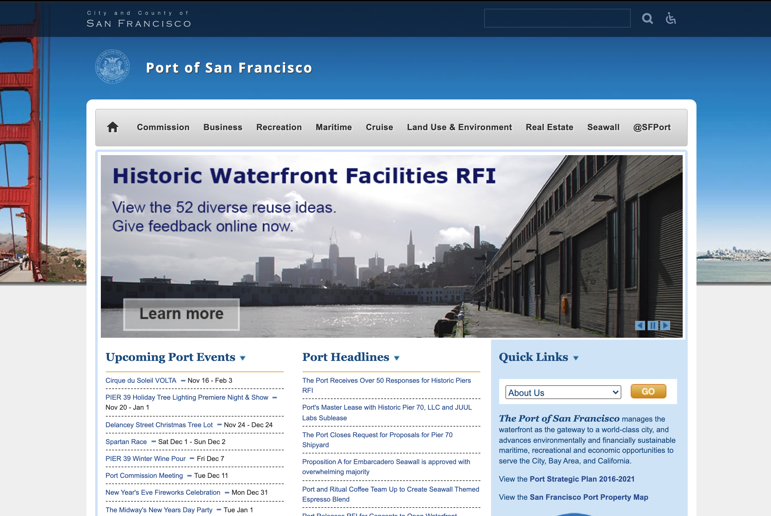
The previous website was barely usable, hard to understand, and visually undeveloped. In our research we sought out what users and internal stakeholders really expected from their website and what their business goals were.
Our starting point - The original website:
The Strategy
Getting Buy-In from Stakeholders
We interviewed 60+ people overall spanning each department of the Port, the businesses hosted on Port property that drive a great portion of their revenue, and end-users we intercepted on the 7.5-mile waterfront from the Aquatic Park to India Basin, all on Port property.
This gave us the foundation on which we designed the site architecture.


Pandemic Sized Challenges
Double Trouble
Usually we work with a development team early on in the process, but in this case there hadn’t been a budget allocated for that yet.
Additionally the world faced COVID, which had arrived when the site development began, so priorities dramatically shifted.
Therefore, the full extent of our design and research is not reflected in the final outcome of the site, though the core idea of highlighting the Port property through a central map with which the visitor can navigate still stands.

Opportunities
The Future
The lack of pressure on the businesses and agencies is understandable in light of the COIVD crisis that hit during development, which made promoting stores, restaurants, and the cruise ship business less relevant. Also, it was hard to ask struggling business owners to do one more thing in their ‘spare-time’.
As an enterprise agency, driving more business to the Port is of utmost importance, but everything took a backseat to the Pandemic.
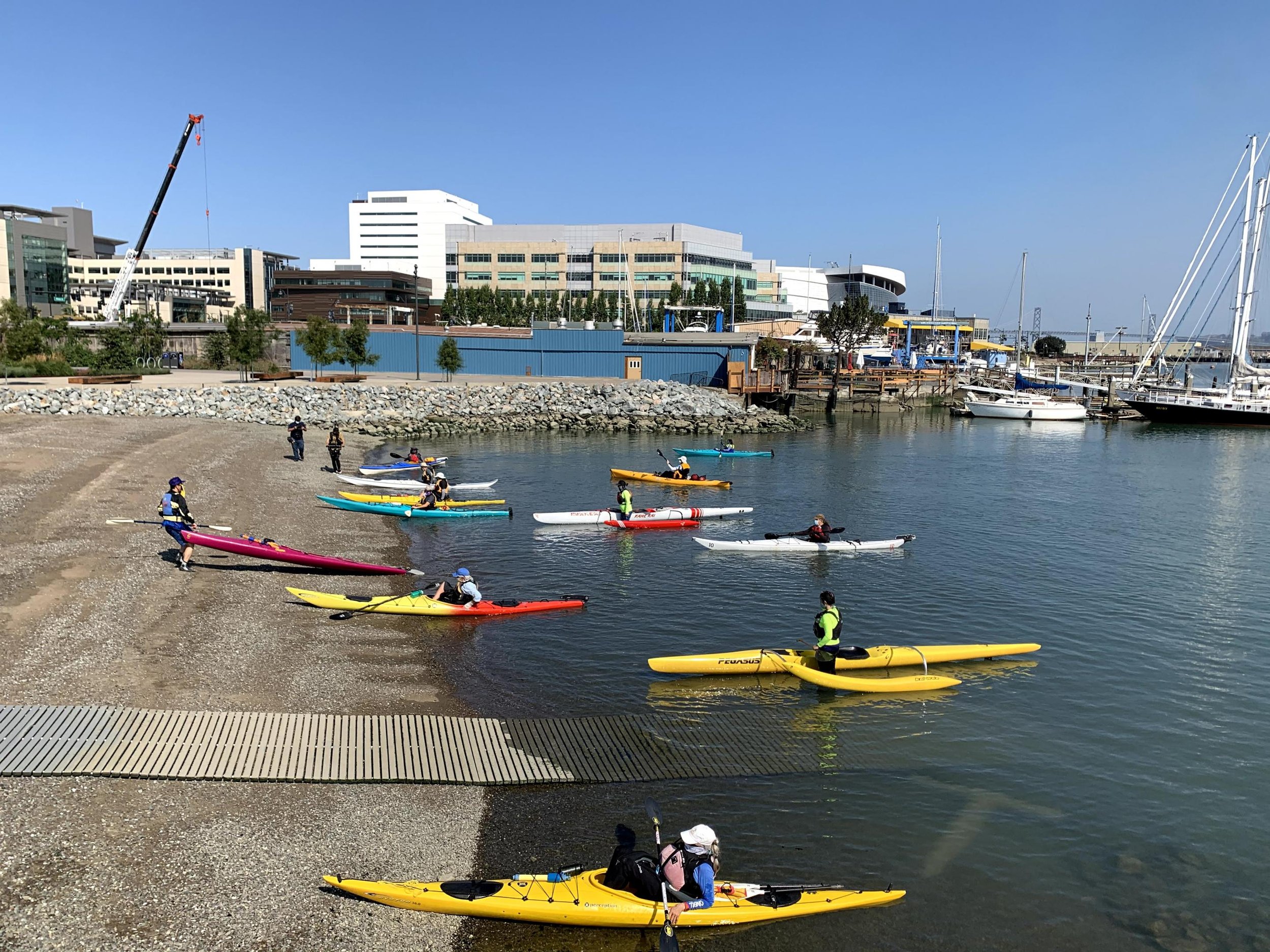
Regardless, the website contains an enormous amount of information - over 8,000 pages - about ferries, shops, restaurants, offices, the Ferry Building, Pier 39, cargo shipping, harbors and berthings, the historic piers, a resilience program to counter sea-level rise, Alcatraz Tours, and the cruise ship industry, on top of all of the day to day business an international Port has to manage. The site is used by a huge variety of user types for all sorts of tasks, including bus routes, parking tickets, trip planning, infrastructure project information, and parking regulations.
Ultimate
Goal
We design a highly visual website that turns the Port into the destination it is.
The directives we distilled from the interviews were:
Drive Revenue through hosted businesses and other fees
Show Quality & Diversity of staff and guests
Engage Community to become part of the Port
Always depict Land and Sea in combination
The new website preserved most of the major directions we determined, using beautiful hero images to promote their destination and marketing initiatives and show diverse images of land and sea while utilizing the logo colors throughout the site. An interactive open-source map is front and center to showcase the expanse of the Port property and allows the user to quickly find destinations.
The next step will be to motivate the businesses and partner agencies to update their information in Openstreetmap.org to make the map truly useful and a valuable asset to visitors and owners.